The proper use of color and the strategic placement of text in images or against colored backgrounds can determine the readability and understandability of content. In some situations, it may seem that it takes away from artistic freedom, however, consider the analogy of choosing a glaze for a ceramic bowl. If you choose a lead-based glaze for the color of the ceramic bowl, it is not safe to eat from; therefore, the ceramic bowl is only for aesthetic, not functional, purposes. When we compose messages on various electronic and information resources (EIR), our goal is to provide functional art. It must be informative first, artistic second.
Best Practices
- Use color in moderation.
- Do not alternate colors repeatedly.
- Take advantage of white space (i.e. any color area that has no text or pattern).
- Use colors that contrast well enough against each other, depending on font size.
- Do not use red and black or the Tarleton purple and black against each other.
- Do not use complementary colors, bright colors, or low contrasting colors against each other.
- Use outlines or drop shadows to separate low contrasting colors and maybe thicker text, but never use just thicker text.
- If possible, increase font size, thickness and/or color when overlaying text on a pattern. If not possible, stick to a solid background color.
Text Overlaying Patterns (or Graphics)
Check out the tools that check color contrast between background colors and patterns versus text.
One of the more challenging issues regarding graphics and text is how to combine the two in the same area. This does not always work. If an adjustment of font size, thickness and/or color cannot make it readable and understandable, then you should consider using a solid background color that contrasts well with the text in the foreground.
| Color and Composition Example | Was it readable and understandable? |
|---|---|
 | No. The black text is in competition with the pattern in the background. As the colors change in the background, they may appear to be part of the characters, creating confusion when attempting to understand the words. |
 | No. The black and white text is still in competition with the pattern in the background. As the colors change in the background, they still may appear to be part of the characters, creating confusion when attempting to understand the words. They also cause confusion by alternating back and forth. Stick to one color in a word, phrase or sentence. |
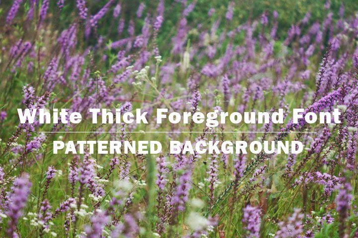 | Sort of. The white text, while bolder is still somewhat in competition with the pattern in the background. As the colors change in the background, they still may appear to be part of the characters, creating confusion when attempting to understand the words. |
 | No. While the background is now shades of the Tarleton purple, the black text is in competition with the shades of color in the pattern in the background. As the shades change in the background, they still may appear to be part of the characters, creating confusion when attempting to understand the words. The Tarleton purple is also not a good contrasting color against black text, so bolding the text will not improve legibility. |
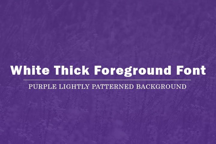 | Yes. The background pattern has been mostly muted, so there is very little question with regard to the start and end of each character against the pattern in the background. The Tarleton purple and white are good contrasting colors as well. |
 | Yes. The background pattern has been mostly muted, so there is very little question with regard to the start and end of each character against the pattern in the background. Black and white are good contrasting colors as well. |
Text Overlaying Wood Patterns
Since we are in a rustic area, we often adopt wood patterns in our backgrounds. These are not easy to make accessible.
| Color and Composition Example | Was it readable and understandable? |
|---|---|
 | No. The black text is in competition with the pattern in the background. As the colors change in the background, they may appear to be part of the characters, creating confusion when attempting to understand the words. It may be possible to thicken the font and/or increase the font size, but it would need to be a significant adjustment. Portions of the wood pattern are dark enough to compete with the black on a large scale, so it may still not be readable. |
 | No. The white text is still in competition with the pattern in the background. As the colors change in the background, they may appear to be part of the characters, creating confusion when attempting to understand the words. It may be possible to thicken the font and/or increase the font size, but it would need to be a significant adjustment. |
 | No. The black text is in competition with the pattern in the background. As the colors change in the background, they may appear to be part of the characters, creating confusion when attempting to understand the words. Given the dark brown color does not contrast well with the black, there is no appropriate solution for this wood pattern against black text. |
 | Yes. The background wood pattern is mostly muted, so there is very little question with regard to the start and end of each character against the pattern in the background, even with the thin font. White contrasts well with the dark brown as well. |
Text Overlaying Solid Colors
When patterns fail, solid colors are the next solution, however, not all colors contrast well.
| Color and Composition Example | Was it readable and understandable? |
|---|---|
 | No. First and foremost, you should only use a red background when stating an emergency. Failing to meet an application deadline may feel like an emergency, but it isn’t a life-or-death emergency. Second, red and black do not go together because they can look the same depending on the color blindness. |
 | No. Red and black do not go together because they can look the same depending on the color blindness. If you use colors that do not contrast well, consider an outline or drop shadow in a contrasting color (e.g. white) and maybe a thicker font. A thicker font on its own does not improve the contrast. |
 | No. Complementary colors (e.g. red and green, purple and yellow, blue and orange) are painfully bright contrasting colors. If converted to grayscale (shades of black), they also appear the same, providing poor contrast depending on the color blindness. |
 | No. The black text is a poor contrast against the dark background color. If you use colors that do not contrast well, consider an outline or drop shadow in a contrasting color (e.g. white) and maybe a thicker font. A thicker font on its own does not improve the contrast. |
 | No. Despite the seeming brighter color of the gold, it is actually too close in shade to the dark gray background color, depending on the color blindness. If you use colors that do not contrast well, consider an outline or drop shadow in a contrasting color (e.g. white) and maybe a thicker font. A thicker font on its own does not improve the contrast. |
 | No. Despite the seeming brighter color of the Tarleton purple, it is actually too close in shade to the black foreground color, depending on the color blindness. If you use colors that do not contrast well, consider an outline or drop shadow in a contrasting color (e.g. white) and maybe a thicker font. A thicker font on its own does not improve the contrast. |
 | No. While the colors appear to contrast against the white, you must consider the brightness, or intensity, of the alternating complementary colors. This can cause headaches whether they are against each other or separated by another color. Be very judicious with colors. Each word, phrase or sentence should be a single color. Depending on your platform (the styles you have available to use), you can make important words stand out in a separate color. Use this in moderation, or your composition will look busy and confusing. |
Using White Space
All the examples above used white space in a suitable manner. White space isn’t necessarily “white”. It is the otherwise empty space separating text and/or patterns (e.g. graphics) from each other that creates readability. Without that white space, compositions may look too busy and confusing, causing headaches and information overload.
| Color and Composition Example | Was it readable and understandable? |
|---|---|
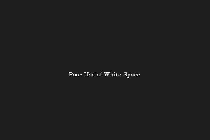 | No. If this was a poster, it would be making an artist statement, interpreted symbolism from the impression of size. From a functional perspective, especially on a call to action button, this is a poor use of white space given its incredibly small size within its boundaries. |
 | No. If this was a poster, it would be making an artist statement, interpreted symbolism from the impression of size, space and layout. From a functional perspective, especially on a call to action button, this is a poor use of white space given its incredibly large size within its boundaries. It is also hard to read given the stretched font and closeness of each character and line of text. |
 | No. Each example is a poor use of white space. The first one doesn’t take advantage of the space in the teal bar and is aligned in an awkward way towards one side of the bar. The second one also doesn’t take advantage of the space despite being centered in the space. The third one over extends itself, bumping too close to the boundaries of the teal bar, despite being centered vertically. Also note the unevenness of the spacing between the teal bars. They should be a consistent spacing to improve reading flow. |
 | Yes. The white text is a good enough size that there is a reasonable amount of padding (or white space) between the text and the teal boundaries. While centering text vertically and horizontally within their boundaries is not a requirement, consistency in spacing of all elements in a composition improves reading flow. If one text element is left aligned, all textual elements should typically be left aligned. Note that justified text is unreadable for many due to the uneven spacing of characters and words. |
Guidelines regarding elements and principles of design can be broken for artistic purposes. For most situations, however, they should be followed for functional purposes.
References
Guides and How-To’s
- The Paciello Group: Colour Contrast Analyser (CCA) (free download)
- Andrew Brandwood’s Text on background image a11y check
- Snook.ca Colour Contrast Check
- Usability.gov’s Web Standards and Usability Guidelines
- Chapter 3: Accessibility
- Chapter 11: Text Appearance
- Chapter 14: Graphics, Images, and Multimedia
- Web Accessibility Initiative (WAI)
- Web AIM
Elements and Principles of Design
- Canva: Design Elements & Principles
- Flyeschool: Elements of Art/Design and Principles of Design/Organization
- John Lovett: Design and Colour
- Envato: Creating Graphic Design and Illustration for Color Blind People
Guidelines
- WCAG 2.0 Guideline 1.4 – Distinguishable
- Understanding WCAG 2.0 Guideline 1.4
- Techniques for WCAG 2.0 G96: Providing textual identification of items that otherwise rely only on sensory information to be understood
- Techniques for WCAG 2.0 G117: Using text to convey information that is conveyed by variations in presentation of text